Wednesday 1 December 2010

Studio Shoots part 2

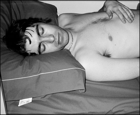
This is the first picture with the grungey background.
So I took away some of the pictures we did from the studio and tuned them into what turned out to be a mad photoshop experiment, which in my favour I think turned out pretty well. I started by adding some floral and abstract style brushes around my body and changed the colours around a bit, At this point it was looking very Microsoft Paint esque so I changed the layer styles of the brushes and added a few light asterix to my body. I then proceeded to have a colour tint background to my body so I created a gradient layer in red and blue and changed the layer style of the gradient to 'Linear Dodge (add)' all of a sudden it was all coming together, so after a bit of patching up and retouching with the photo and the effects I had a thought on what I could do next with the work so I added a stained paper texture which was really nice and grungy to add some depth and look to the background, lowering the opacity of the stains and giving it a red and blue gradient tint it all fit in quite nicely. I saved that as one version and then proceeded to create a second version without the grunge just to give it a more a veer towards the photography side rather than Graphic design. I then intended to use the design to see if I could make some CD covers out of it, after a second thought I then resized the photo to create a flyer for some sort of Party or Gig for example. I thought it would be good if I went with an American college theme after I found a nice old school font on the internet, after fiddling with the layer styles I got a really nice look.
This is the second of the pictures without the grunge.

I think that this picture is the smarter of the two without the grunge because it looks tidy and more complex than the other, with the others you could argue the image is too busy but I think this one has a nice volume to it.

This is the flyer I made from the picture, the word 'Waterloo Sunset' is a song by The Kinks and I think the word and the look of the word really fits in with the design. After a second look at it I would certainly use it as a CD cover or a promotion advertisement on a website or in a magazine e.g.

Thursday 18 November 2010

Studio shoots

For the Band identity project we had to do a studio shoot, so we got ourselves together in the studio and worked with the little props we had and this is what we came up with after a bit of retouching and editing on Photoshop, and I think this looks really good in a variety of types especially as a poster.

Wednesday 6 October 2010

CD cover research


The album cover at the top was one of the first Joy Division albums 'Substance' designed by Peter Saville, the design is now a well renowned t-shirt design but at the same time is very strange. I can only presume it is either a take on a mountain skyline or a pile of heartbeat monitor control. But with Peter Saville, Joy Division and the rest of there designs, you will never know.

The second of the two above is Maximo Park's 'A Certain Trigger' This is one of my favourite designs and a CD cover that has caught my eye in the past, Maximo Park are a very good band, and this design shows that with the photo representing movement and life, and the block red text which very largely emphasises Maximo Park's red and black theme. 


Flyer Design.


As an add on to the poster, we were asked to also take a picture for a flyer, I mostly used the same sort of effects as the poster, but with a blue and red gradient and the same fonts used, I also again used the high pass/hard light effect to give the image a contrast.

Poster design.

On our trip looking for a photo around Burton, I spotted a group member looking at a wall with an umbrella, as seen below. I thought this was a good photo so I photographed and used it to design my poster. I begun editing the photograph by putting a high pass on the picture (>FILTER>OTHER>HIGH PASS) and then set the layer style to hard light, I then thought it would look good if I added a colour glow over the picture so I created a gradient layer using red and green and set the layer style to screen. I also added lines going in different directions at the bottom to give it depth. For the main bit I created the band logo by using a font called '215000E' I then used clippings from a mens fashion magazine and a band of brothers photo from Iraq in the clipping mask, I also stroked the text with outside black 7px, and used windows default font 'Myraid Pro' and shortened the kerning of the text which looks really good with that particular font. 'The Abbey' flyer to follow.                                                        


Tuesday 5 October 2010

Poster and flyer assignment

We were given the task of going out around Burton and take pictures that we thought was fit to be a background for a poster and a flyer promoting a gig night, to follow I will put up the original photo and poster soon to be followed by a flyer.

Wednesday 22 September 2010

CD cover designs

CD cover designs.

We were given the task of creating album covers, using the most random picture but it had to be Flickr's most interesting, the name of the band had to be a random article from a wikipedia and the album name was the last bit of a random quote. Here are my designs of 'Molecule Motor' album titled 'Lonliness is underrated'

Wednesday 15 September 2010

Peter Saville


Peter Saville is a graphic designer who was in partnership with late Grenada presenter Tony Wilson and Rob Gretton who together formed 'Factory records' while working at Factory he designed album covers for Joy Division, Happy Mondays, New Order and also all of the factory records art and the design of Factory's 'Hacienda Night Club' Without knowing that Saville was the mastermind behind the cover art for Factory Records I have always been really inspired by the design of Factory's logo's and posters and Peter Saville is somebody who I will most definately look into in the future.

Peter Saville Factory poster


Happ Mondays cover


Royal Mail record cover stamps.

The Royal Mail are set to release a new range of postal stamps based around great British classic albums set to go on sale in Post Offices up and down the country sometime this year or so, I thought it was a brilliant idea and I'm sure it will catch the eye of many stamp collectors. The masterminds behind this idea are StudioDempsey designing all the stamps which range from album covers from Blur's 'Parklife' album (designed by Chris Thomson / Stylorouge. Photography: Bob Thomas), New Order's beautiful 'Power, Corruption and lies' (Designed by Peter Saville)

Joy Division

I'm mainly inspired by the photography of Joy Division as many photographers capture the Gloom of the band by presenting it in Black and White.

This photograph was taken by a young photographer at the time called Jill Furmanovsky who emigrated from Zimbabwe with her parents in 1965, she is a rock photographer who has worked for London's Rainbow Theatre after studying at an Art & Design college. Over her career she has photographed many of the biggest names in Post Punk, Rock and roll which include: Oasis, Joy Division, The Clash, Led Zeppelin and The Pretenders. She has also brought out a book in 1995 called 'The Moment - 25 years of Rock Photography' followed by Oasis' 'Was there ten' tour in the same year.

She writes about this particular photograph of Joy Division her book in the caption beneath the photograph which I think really portrays the distinctiveness and quality that Joy Division put forth towards the post punk era, despite the band looking happy in general here, there music was very dark and Ian Curtis' lyrics almost drew you in to a pondering thought of life. In the period after the photograph with Joy Division enjoying much success.. the lead singer Ian Curtis (second one in from the left) hung himself at his Macclesfield home as a result of suffering manic depression, epilepsy and marriage problems.


                                            (Liam Gallagher of Oasis on the Was there ten tour)